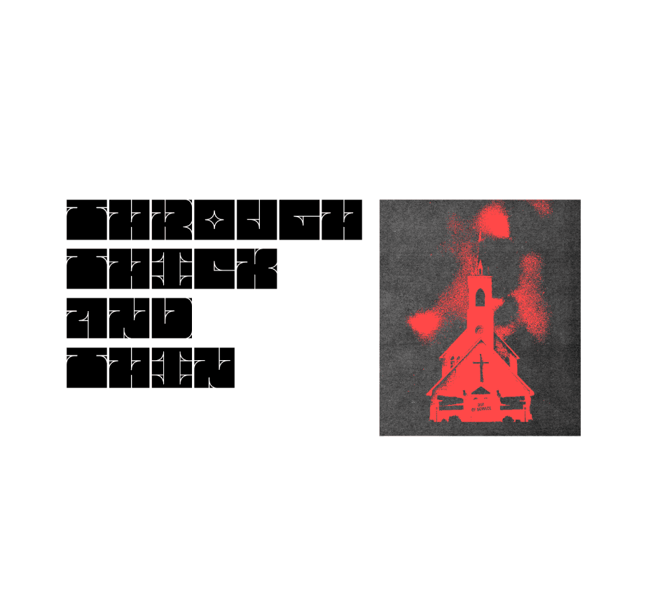
THROUGH THICK AND THIN

Intro

'Through Thick and Thin' is an experimental bold typeface designed as a classroom project inspired by the style of Wes Wilson. Each character begins as identical rectangular blocks, with negative space strategically removed to reveal letterforms. The design uses deliberate line work to form counters, bars, ascenders, descenders, and terminals—essentially creation by subtraction.

Year

/

2021

Year

/

2021

Year

/

2021

Client

/

Self Intiated

Client

/

Self Intiated

Client

/

Self Intiated

The font's distinctive feature is how it uses simple line elements to define character shapes while maintaining consistent dimensional boundaries.

Next work

The font's distinctive feature is how it uses simple line elements to define character shapes while maintaining consistent dimensional boundaries.

The font's distinctive feature is how it uses simple line elements to define character shapes while maintaining consistent dimensional boundaries.

Next work

"I've worked with Owen on transforming our digital presence, and he was essential to our growth. He has this ability to understand business challenges, not just make things look pretty. Owen built custom solutions that streamlined our processes and made our team more efficient. Working with him was seamless and professional."

Client name

Client role

"I've worked with Owen on transforming our digital presence, and he was essential to our growth. He has this ability to understand business challenges, not just make things look pretty. Owen built custom solutions that streamlined our processes and made our team more efficient. Working with him was seamless and professional."

Client name

Client role

Create a free website with Framer, the website builder loved by startups, designers and agencies.